Kvika
Bank of transformations
About the project
With the merger of two of the largest investment banks in Iceland, an opportunity to approach banking in a different way presented itself. It was decided to develop a policy that would empower the bank as transformative force and that the customer experience would be enhanced by the bank's branding in a more tactile way.
We were a part of this process from the very start, choosing a name, designing a logo, and creating a world of design that would lead customers into the realm of Kvika.
Goal
To create the image of a company that might have existed for a 100 years and will exist for at least another 100 years.
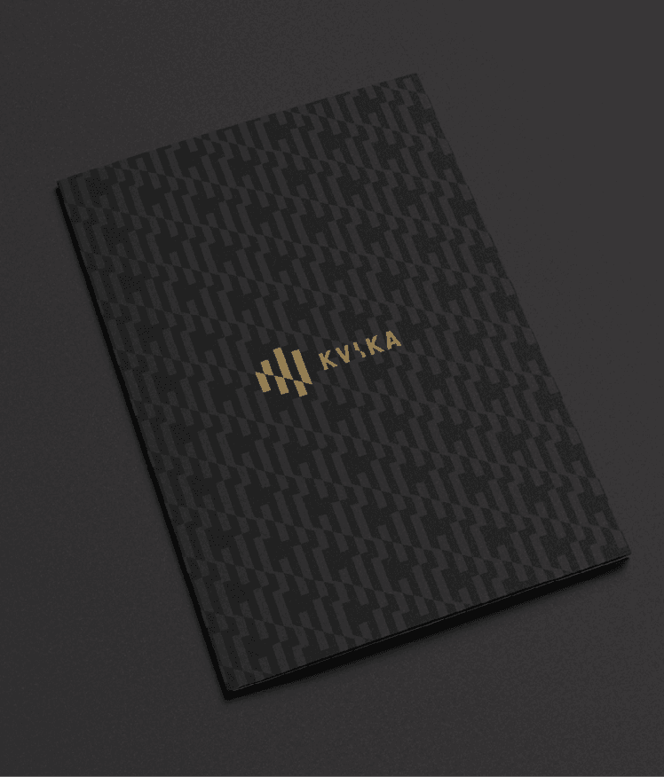
Design
All design was inspired by the concept of Kvika being a bank of transformation. Everything was designed with this concept in mind, from the name of the bank (meaning "magma") to the voice on the answering machine, from printed material to the digital world and from advertisements to the bank's interior.
Conclusion
The award for Branding of the Year at the Icelandic Advertising Awards.


Target demographic
The target demographic was a group of about 100 people, the employees of the bank. Iceland's best of the best in the financial world, handpicked to take care of your finances.


Interior design
Every aspect of the overall look of Kvika was conceived by Hér&Nú. The designers of HAF Studio and the photographer Marinó Thorlacius also played a part in locating and marking the brand within the bank's environment.


Next project
@ Hér&Nú 2025
Kt. 690190-1339
Vsk. nr. 22731